Teleo brand
17 Jan 2018
I designed a brand new brand for Teleo, a new team collaboration app with all the tools you need in one place.
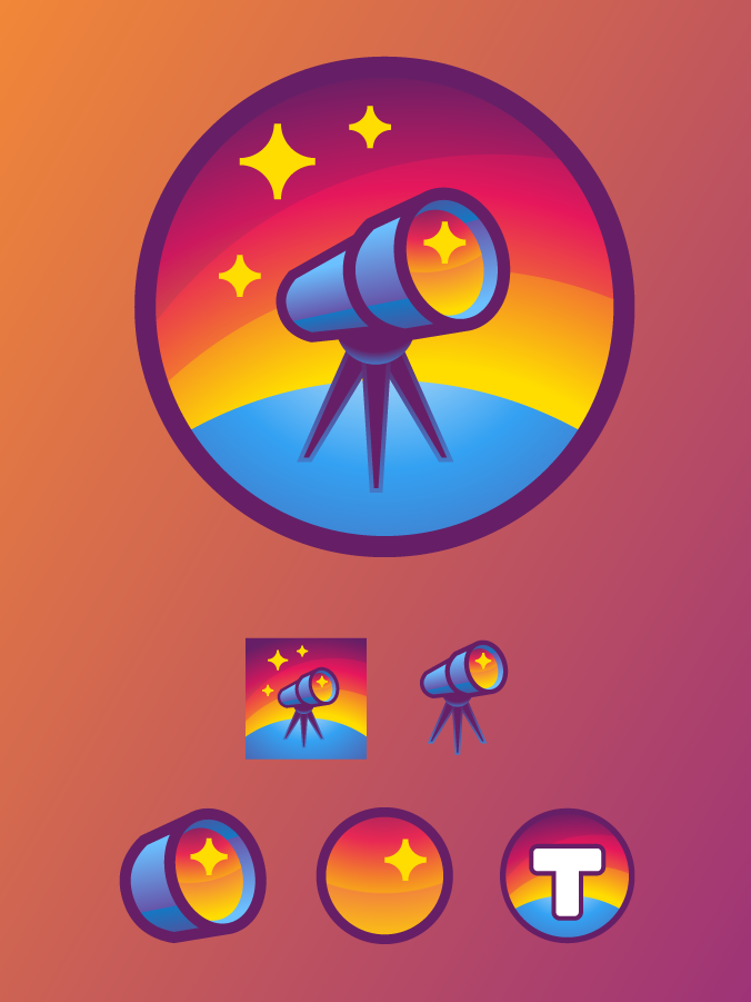
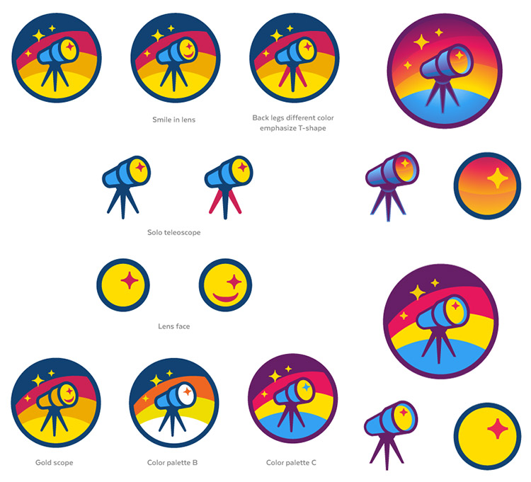
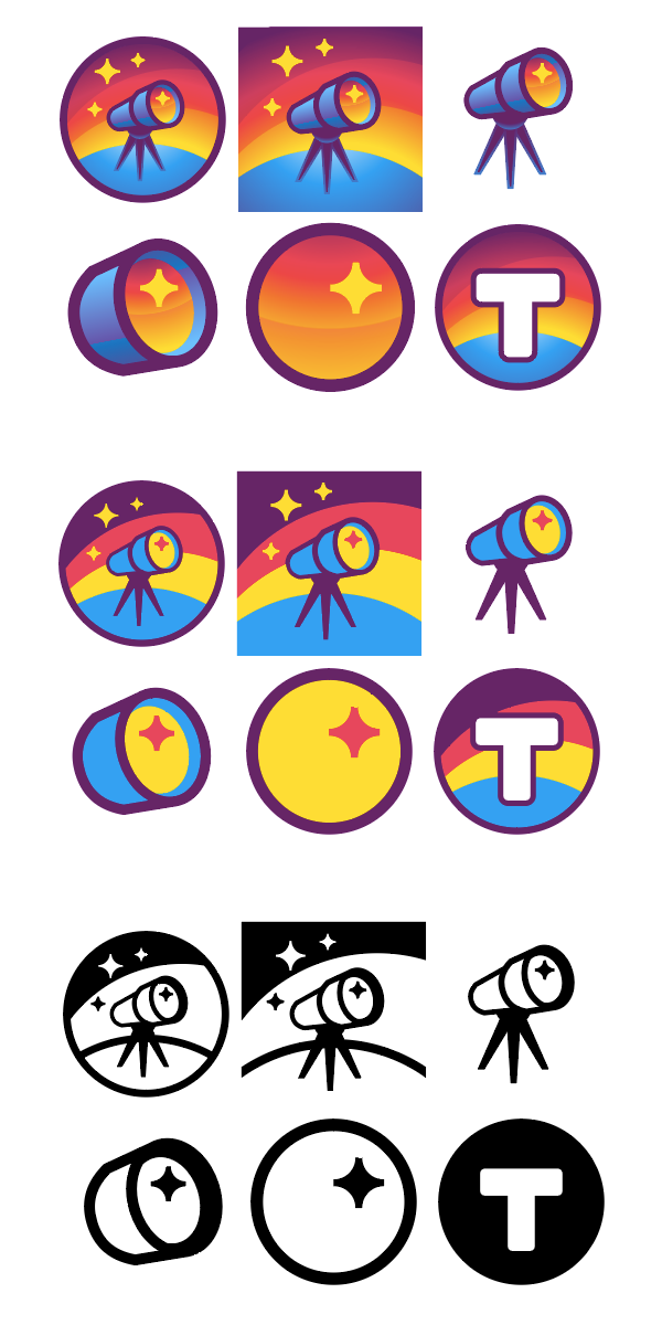
The main logo is comprised of a telescope sighting beyond a starry, domed sky. The telescope signals Teleo's value as a tool for communication over distances, and nicely associates with the name (Say it with me: Teleo, telescope). The brand includes alternate logos with telescope head, lens face, and initial T.
Initial concepts played with the classical philosophical term teleology. From Wikipedia:
Teleology is a reason or explanation for something in function of its end, purpose or goal. ... For instance, Aristotle claimed that an acorn's intrinsic telos is to become a fully grown oak tree.
Hence, the acorn/oak and chicken/egg concepts. Also, antelopes.
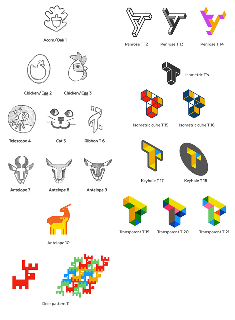
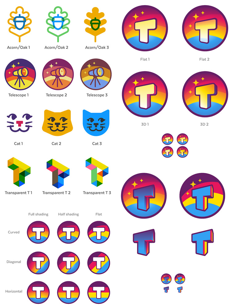
The telescope concept was promising, but missing the oomf. I added shading with gradients to give the scene depth with a sense of lighting. The telescope lens could better reflect the sky. The telescope legs got beefed up to make it feel more stable.
The shaded imagery was looking hot. But it wouldn't hold up in every application. So I designed flat-color and one-color variations of all the designs.
That rainbow will shine on forever.
Interested in a logo for your work? Get in touch! Email yo@metafizzy.co to get started.