Slack logo armchair redesign
24 Jan 2019
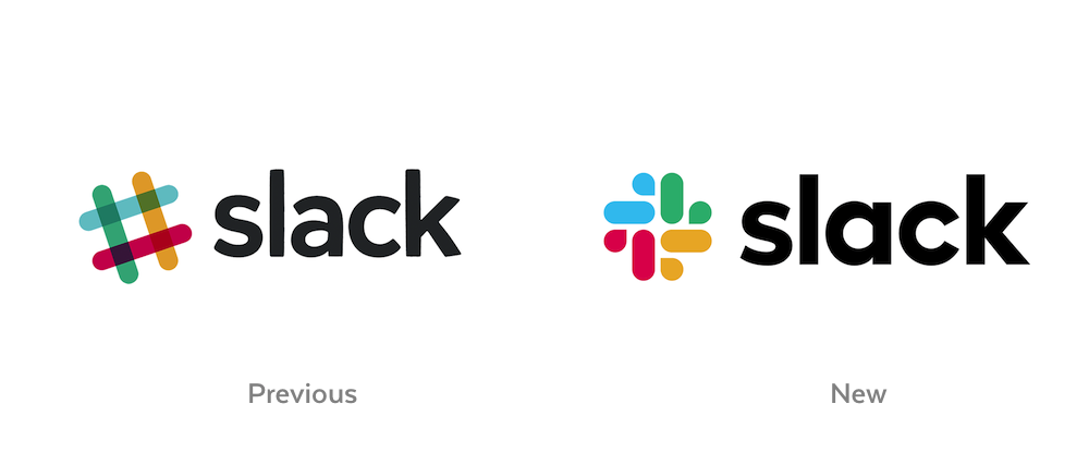
Slack has a new logo. It hits its marks!

Slack's new logo is successful because it resolves all of the issues the previous logo had.
- Too many colors
- Problematic on dark and photo backgrounds
- Required multiple variations for various applications
- Problematic rotation
As the Slack team put it, "It was extremely easy to get wrong."
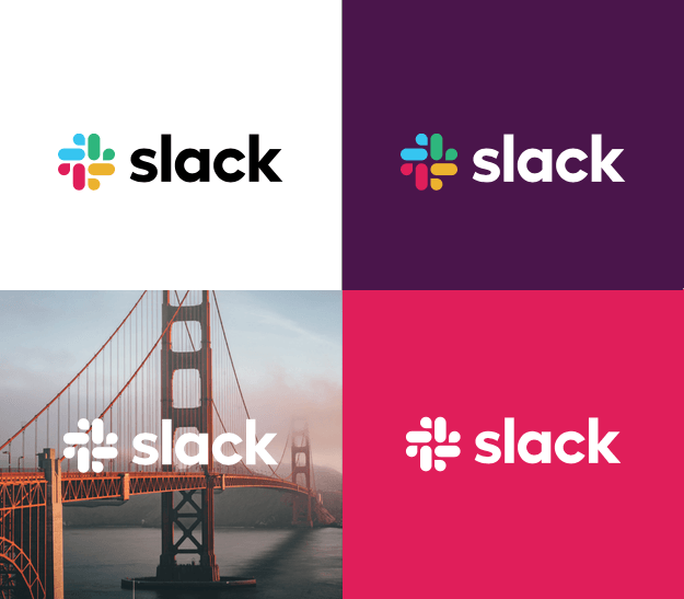
The new design fixes all these problems with a distinct iconic logo. It works on light, dark, photo backgrounds. It can be rendered with multiple colors or just one. The new logo makes it easy to get it right.

That said, I miss the plaid. John Gruber elaborates:
Unique among technology companies, [Slack] owned plaid. ... To such a degree that Slack company socks — which simply used colors and plaid — became coveted swag.
I saw this opportunity as a worthwhile exercise for my logo design chops — to design a new logo that addressed Slack's original concerns while also keeping the plaid.
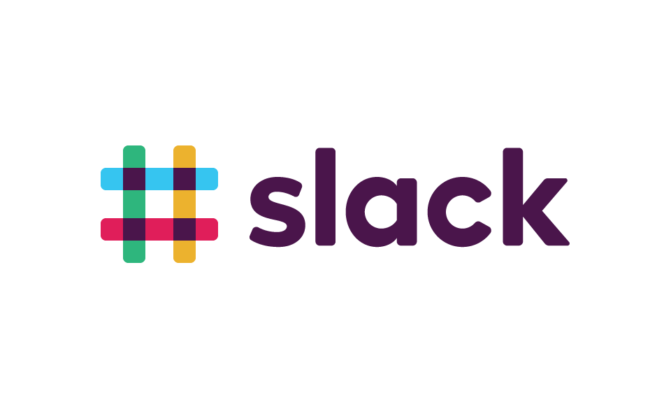
Here's my armchair-proposed design.


The octothorp emblem is rendered with four rounded rectangles. The overlapping squares are all colored the same dark purple (aubergine). Technically, this is not how multiply blends work. But visually, unifying those four squares simplifies the design. The aubergine color and rounded corners are then brought over into the wordmark, tying the two elements together.
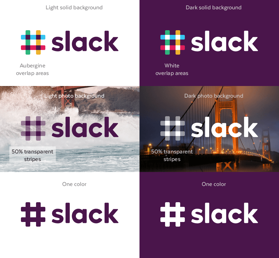
Keeping the plaid means that the multi-color problems persist. To address these, I created several design variations. For solid dark backgrounds, aubergine is swapped for white. For photo backgrounds, the octothorp stripes are rendered with 50% transparency, trickily rendering the plaid with a single color. Finally, there's a one-solid-color variation as a last-resort option.
The plaid is preserved, but it comes at the cost of complexity. Like the original logo, this design still requires multiple variations. It's not as easy to get right in application, but it maintains Slack's previous unique visual identity. It's a trade-off.
So, that's how I would approach this project. I'm still not feeling 100% with my design. It feels a bit too generic, like it needs another couple iterations to achieve its final form. But I'm putting my pencil down for now as it shows how plaid can work.
.•*•.• Plaid can work .•*•.•
