
Metafizzy wordmark v4: SVG first
29 Aug 2018
One of the perks of working for yourself is that you can do a rebrand on a whim.
CodePen
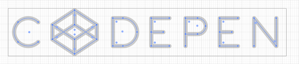
Last year, I got a chance to work on the wordmark for CodePen. Unlike most wordmarks, the CodePen wordmark was never designed with a font. Rather, all the letterforms are comprised of simple geometric shapes, rendered with a stroke in SVG. Using straight lines and semicircles, the SVG code for the wordmark is concise and elegant, a mere 500 characters. The wordmark's design extends beyond its visuals, into its underlying code. It is a lovely microcosm for CodePen itself, an enlightening demo in its own right.
See the Pen CodePen logo SVG, v2 by Dave DeSandro (@desandro) on CodePen.
As I wrapped up my work on the wordmark, I felt jealous that Metafizzy's wordmark lacked this elegant code quality. So I set off to fix it.
Prior wordmarks
James Edmondson designed the first Metafizzy wordmark in 2012. He delivered a loose ribbon-like script that felt alive and personable. During the design process, he also produced a couple geometric designs with a fixed line width.
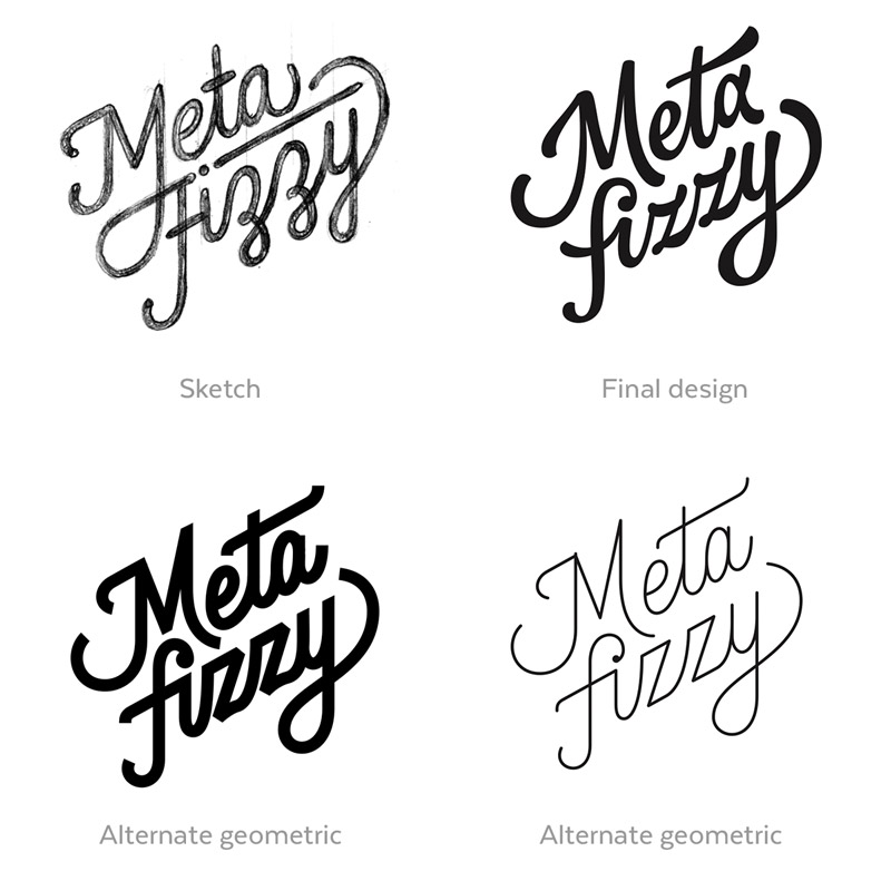
These geometric designs always kept a place in my heart. In the previous v3 rebrand, I went back and tried to design a wordmark closer this geometric script. The final design was a simpler script based off a geometric design.

It was a serviceable design, but its SVG code was a hodgepodge as one would expect.
The goal with this redesign (rebrand #4 if anyone is counting), was to design a wordmark optimized for SVG first. The visual design of the wordmark would be directed by how SVG code works. To produce less SVG code, I designed the wordmark with these contraints:
- Use only strokes for fewer points and elements
- Align points to pixel grid for no decimal values
- Use elliptical arcs over bezier curves
Elliptical arcs
SVG has an interesting feature. <path> elements are the SVG elements used for non-standard shapes (like a circle or rectangle).. The actual shape of <path> elements are defined by a set of commands. These commands work like connect-the-dots, directing the rendering engine point-by-point where to draw next. (The syntax is remarkably reminiscent of the Logo programming language and its turtle graphics. Takes me way back.)
There are commands for straight lines L, H, V and for bezier curves C, S. There are also commands for special curves: quadratic curves Q, T and elliptical arcs A. The elliptical arc command is particularly useful as you define the size of the ellipse, rather than the control points for a bezier curve. So it is more human readable and may require less code than a bezier curve.
For example, a three-quarter circle requires 3 bezier curve commands but only 1 elliptical arc command.
See the Pen SVG bezier vs arc commands by Dave DeSandro (@desandro) on CodePen.
Wow, you just wasted my time slogging though this code minutia. But code minutia, I counter, is what the Metafizzy brand is all about.
Wordmark design
As the cliché holds, the constraints drove creativity, directing the process along industrial guardrails.
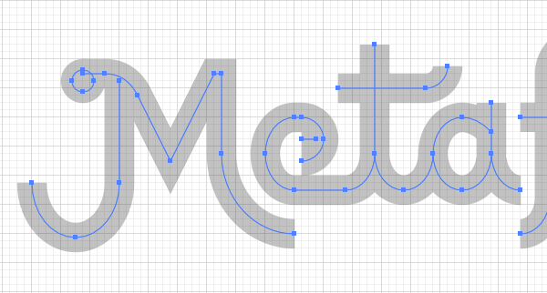
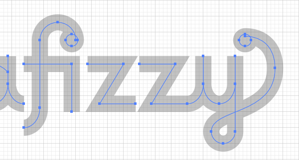
The basic design of previous Metafizzy wordmarks is still intact: swashes, dots, ligature fi. But the construction has been dramatically simplified with straight lines and elliptical curves.
A proper typographer might start with this strict geometric design, but would be quick to start refining it for optical visibility. Even though these shapes are mathematically aligned, human eyes see them differently. Circles don't look circular. Horizontal and vertical lines appear to have different weights. Curves don't reach edges. Many subtle improvements are required to make geometric type look geometric. But for this project, all those quirks are left in to keep the SVG code short & sweet. It's part of the charm.
Strokes only
Using only stroke shapes required a couple hacks. The dots are rendered as rings with strokes wide enough to fill their hole. There's an extra horizontal line to fill in the e. But using only strokes yielded several nice features.
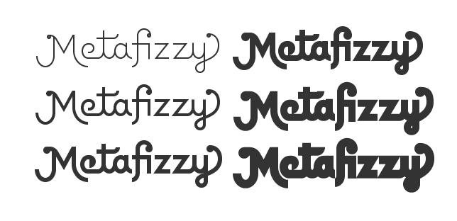
The wordmark SVG is way easier to style in CSS, setting only stroke.
/* standard display white*/
.mfzy-wordmark { stroke: #FFF; }

/* highlight blue on hover*/
.mfzy-wordmark:hover { stroke: #19F; }
The stroke-only design lends itself to easier stroke-width variation. I was able to produce a variety of weights.
Stroke paths can then be used for animated vector lettering. Thanks Hali!
See the Pen Metafizzy animated SVG wordmarks by Dave DeSandro (@desandro) on CodePen.
SVG code
Here is the real wordmark design, its lovingly-hand-coded SVG:
<svg class="mfzy-wordmark" xmlns="http://www.w3.org/2000/svg"
  viewBox="0 0 280 80" fill="none" stroke="#333" width="140" height="40">
  <g transform="skewX(-18)">
    <path stroke-width="8" d="M38 20h6c4 0 7 2 9 6l9 18l12-24h2v22
    a20 22 0 0 0 20 22M48 22v28a12 15 0 0 1-24 0M98 44a6 6 0 0 0 0-12h-2
    a8 10 0 0 0 0 20h14a8 10 0 0 0 8-10M118 12v30a8 10 0 0 0 16 0M150 36
    q-4-4-8-4a8 10 0 1 0 8 10m0-14v14a8 10 0 0 0 8 10M184 20a9 9 0 0 0-18 0
    v34a8 10 0 0 1-8 10M158 32h24v24M190 32h18l-12 20h18M216 32h18l-12 20h18
    a8 10 0 0 0 8-10m0-14v14a8 10 0 0 0 16 0m0-14v38a6 6 0 0 1-12 0
    c0-12 32-8 32-32c0-10-6-16-15-16M108 24h24a6 6 0 0 0 6-6M102 38h-4" />
    <g stroke-width="6">
      <circle cx="38" cy="22" r="3" />
      <circle cx="182" cy="20" r="3" />
      <circle cx="269" cy="20" r="3" />
    </g>
  </g>
</svg>
The design and code was done with square proportions and perpendicular lines. This allowed me to use whole number values and elliptical curves. The slant is done afterward in SVG with a transform: transform="skewX(-18)". 18° is the angle of the Metafizzy bear's leg.
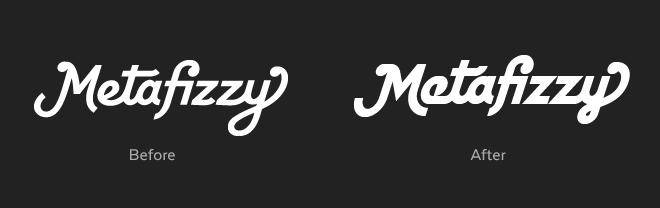
Pixels
Adhering the strokes to a grid gives the design its own native size 280 x 80, with stroke-width of 8. This means I can resize the wordmark in multiples of 70 x 20 and the strokes will align perfect to a pixel grid. See how there's no fuzzy pixels above & below the z's.
![]()
![]()
It's done...ish
You don't have to be precious with your brand. Not every rebrand needs to be a monumental overhaul revealed with a huge splash. In the digital age, most are better without it.
The majority of the work on this wordmark was done a year ago. Since then, I've been trying it out here & there, getting a better sense of how well it works in practice and how I feel about it. I'll likely keep fiddling away at this design. But after a year, it was time to at least give it a proper introduction.