Smalhaus is an independent software development studio and retail consultancy. I worked with boss-man Dustin to deliver a logo that communicated Smalhaus' craftsman qualities. Smalhaus means 'small house.' Don't overthink it. The logo depicts a little abode forming an S, with a door frame and chimney forming a lowercase h.
One of the perks of working for yourself is that you can do a rebrand on a whim.
CodePen
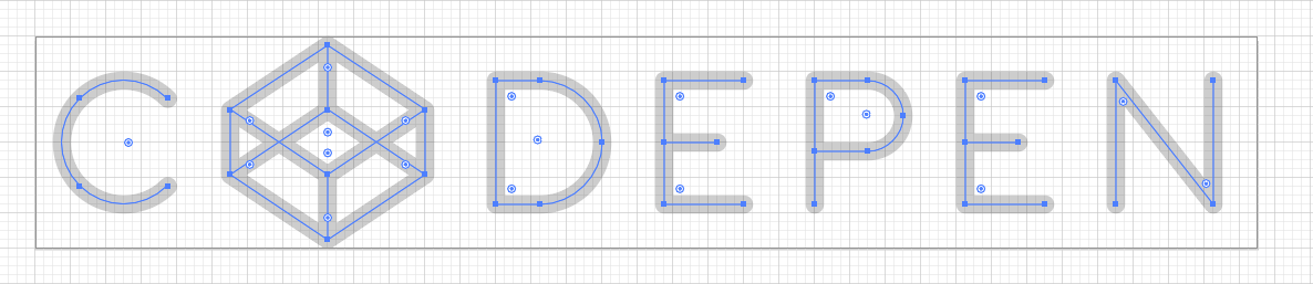
Last year, I got a chance to work on the wordmark for CodePen. Unlike most wordmarks, the CodePen wordmark was never designed with a font. Rather, all the letterforms are comprised of simple geometric shapes, rendered with a stroke in SVG. Using straight lines and semicircles, the SVG code for the wordmark is concise and elegant, a mere 500 characters. The wordmark's design extends beyond its visuals, into its underlying code. It is a lovely microcosm for CodePen itself, an enlightening demo in its own right.
These geometric designs always kept a place in my heart. In the previous v3 rebrand, I went back and tried to design a wordmark closer this geometric script. The final design was a simpler script based off a geometric design.
It was a serviceable design, but its SVG code was a hodgepodge as one would expect.
The goal with this redesign (rebrand #4 if anyone is counting), was to design a wordmark optimized for SVG first. The visual design of the wordmark would be directed by how SVG code works. To produce less SVG code, I designed the wordmark with these contraints:
Use only strokes for fewer points and elements
Align points to pixel grid for no decimal values
Use elliptical arcs over bezier curves
Elliptical arcs
SVG has an interesting feature. <path> elements are the SVG elements used for non-standard shapes (like a circle or rectangle).. The actual shape of <path> elements are defined by a set of commands. These commands work like connect-the-dots, directing the rendering engine point-by-point where to draw next. (The syntax is remarkably reminiscent of the Logo programming language and its turtle graphics. Takes me way back.)
There are commands for straight lines L, H, V and for bezier curves C, S. There are also commands for special curves: quadratic curves Q, T and elliptical arcs A. The elliptical arc command is particularly useful as you define the size of the ellipse, rather than the control points for a bezier curve. So it is more human readable and may require less code than a bezier curve.
For example, a three-quarter circle requires 3 bezier curve commands but only 1 elliptical arc command.
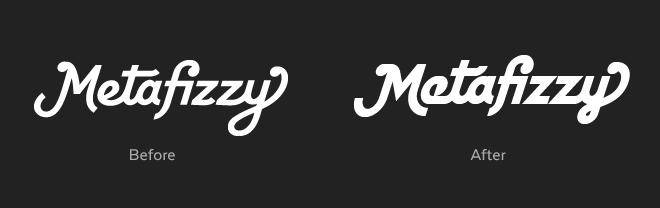
Wow, you just wasted my time slogging though this code minutia. But code minutia, I counter, is what the Metafizzy brand is all about.
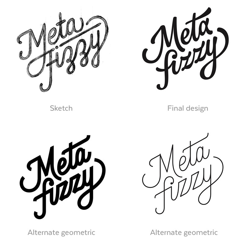
Wordmark design
As the cliché holds, the constraints drove creativity, directing the process along industrial guardrails.
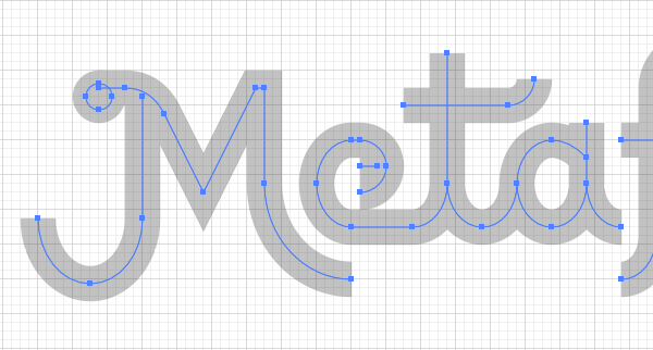
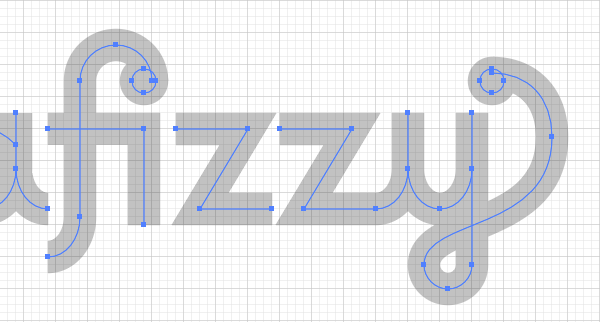
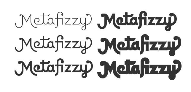
The basic design of previous Metafizzy wordmarks is still intact: swashes, dots, ligature fi. But the construction has been dramatically simplified with straight lines and elliptical curves.
A proper typographer might start with this strict geometric design, but would be quick to start refining it for optical visibility. Even though these shapes are mathematically aligned, human eyes see them differently. Circles don't look circular. Horizontal and vertical lines appear to have different weights. Curves don't reach edges. Many subtle improvements are required to make geometric type look geometric. But for this project, all those quirks are left in to keep the SVG code short & sweet. It's part of the charm.
Strokes only
Using only stroke shapes required a couple hacks. The dots are rendered as rings with strokes wide enough to fill their hole. There's an extra horizontal line to fill in the e. But using only strokes yielded several nice features.
The wordmark SVG is way easier to style in CSS, setting only stroke.
/* standard display white*/.mfzy-wordmark { stroke: #FFF; }
/* highlight blue on hover*/.mfzy-wordmark:hover { stroke: #19F; }
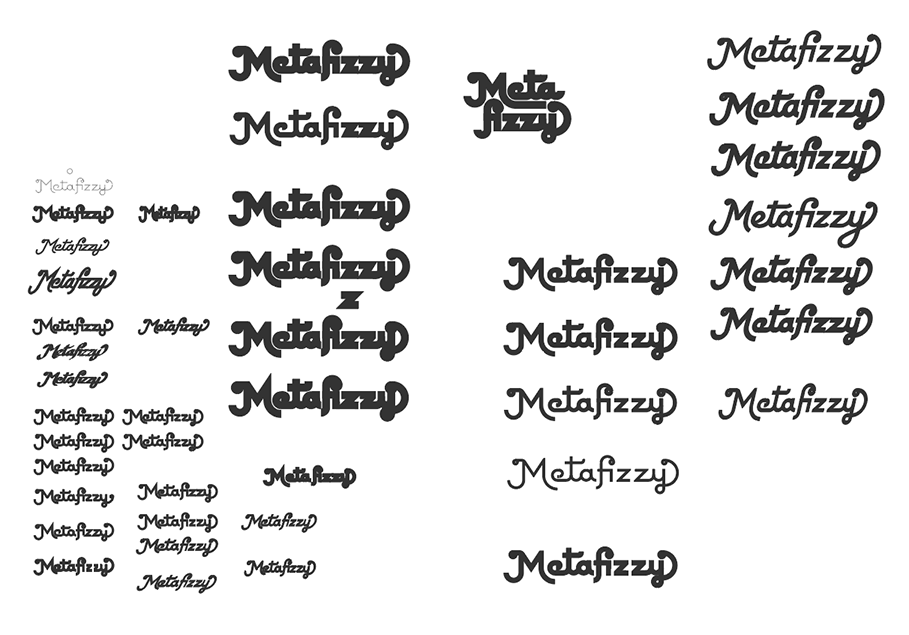
The stroke-only design lends itself to easier stroke-width variation. I was able to produce a variety of weights.
Stroke paths can then be used for animated vector lettering. Thanks Hali!
The design and code was done with square proportions and perpendicular lines. This allowed me to use whole number values and elliptical curves. The slant is done afterward in SVG with a transform: transform="skewX(-18)". 18° is the angle of the Metafizzy bear's leg.
Pixels
Adhering the strokes to a grid gives the design its own native size 280 x 80, with stroke-width of 8. This means I can resize the wordmark in multiples of 70 x 20 and the strokes will align perfect to a pixel grid. See how there's no fuzzy pixels above & below the z's.
It's done...ish
You don't have to be precious with your brand. Not every rebrand needs to be a monumental overhaul revealed with a huge splash. In the digital age, most are better without it.
The majority of the work on this wordmark was done a year ago. Since then, I've been trying it out here & there, getting a better sense of how well it works in practice and how I feel about it. I'll likely keep fiddling away at this design. But after a year, it was time to at least give it a proper introduction.
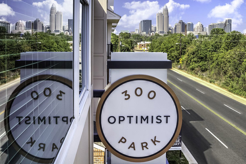
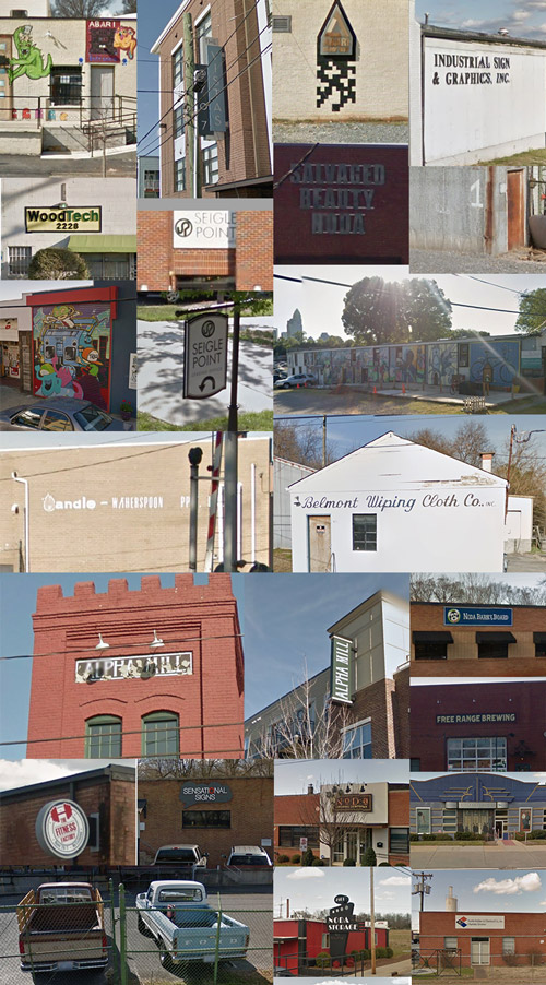
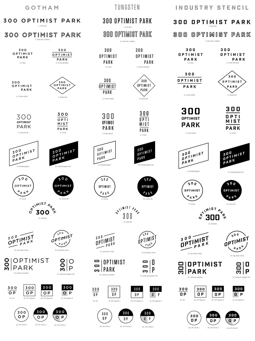
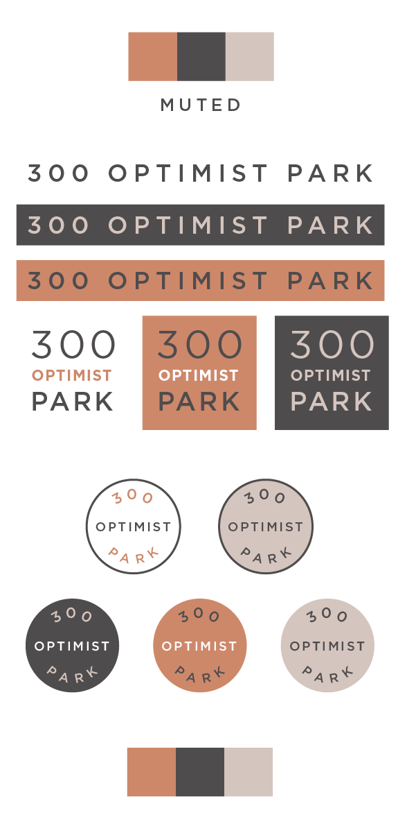
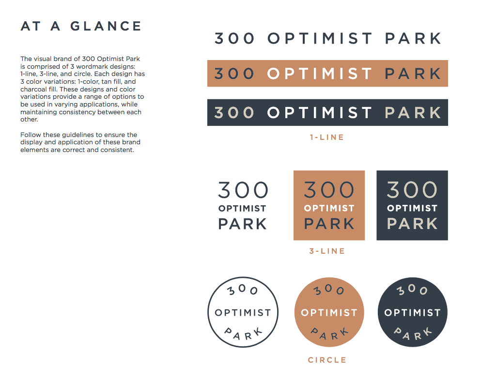
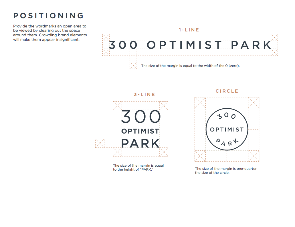
Last year my buddy Andy reached out to design the logo for 300 Optimist Park a new apartment building going up in Charlotte, North Carolina. We worked together, looking at local type, trying out fonts, eventually honing in on the final design as a set of 3 wordmarks in 3 color palettes. One year later, the building is up and ready to rent. That sign is my first physical signage ever to go up (a proud moment).
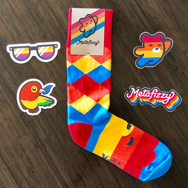
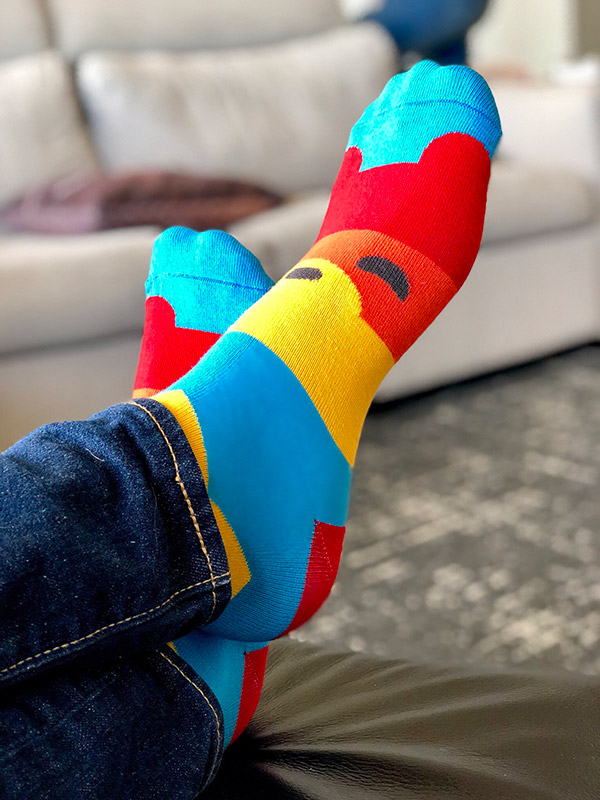
I love socks. Slipping into a pair of socks you adore can change your whole day. No matter how bad things get, at least you're feet are living their best life. That's why I made Metafizzy socks. Wild colors, overly-cute design. These are the socks my feet were made for.
Metafizzy socks feature argyle design on leg and fizzy bear face on the top of the foot. Things are looking up for that cutie. Knit with comfy-soft cotton threads, you'll be walking on sunshine. Colors are a show-stopping combo of red, orange, gold, and blue. 1-size fits all Adult Medium. Made in the USA.
I designed the mascot & logo for Pre, a social app for sharing moments with your best friends.
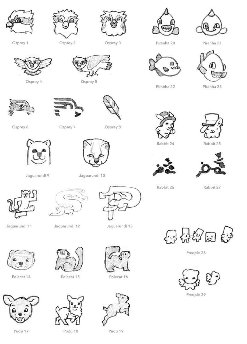
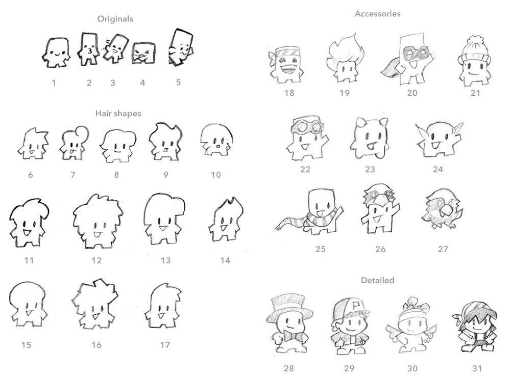
I explored a variety of concepts in the initial sketches, going for friendly and lightweight.
Osprey - It has "pre" in the name
Cute, bouncy mammals - Jaguarundi, polecat, and pudú
Piranha - Sort of sounds like "pre": pre-ranha (work with me)
Rabbit - A take on the rabbit in the hat from Alice in Wonderland. Trying to meet up.
Preeple - abstract humanoid cuties
Sensing a promising lead, I then did a wider exploration of the Preeple concept. I tried out hair shapes, accessories, and more detailed character designs
We selected Osprey 3, Rabbit 24, and Preeple 28 sketches to work on in vector.
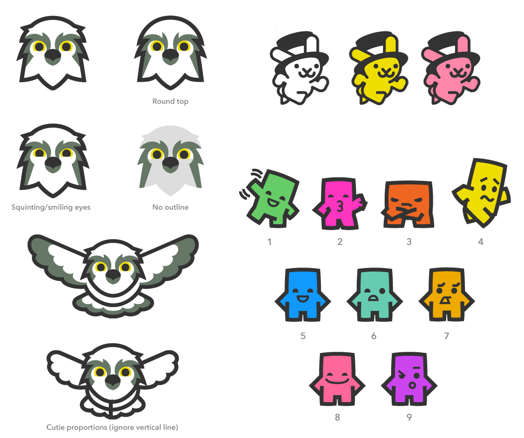
Several of theses concepts went to live on as logos for Logo Pizza. Osprey and Mechanical hare are available for sale.
For Pre, we landed on the Preeple 1 design, with a little dude waving to say hello. He perfectly exemplified the character of Pre: friendly, simple, and inviting. From there, I chisled out the finer details of the design.
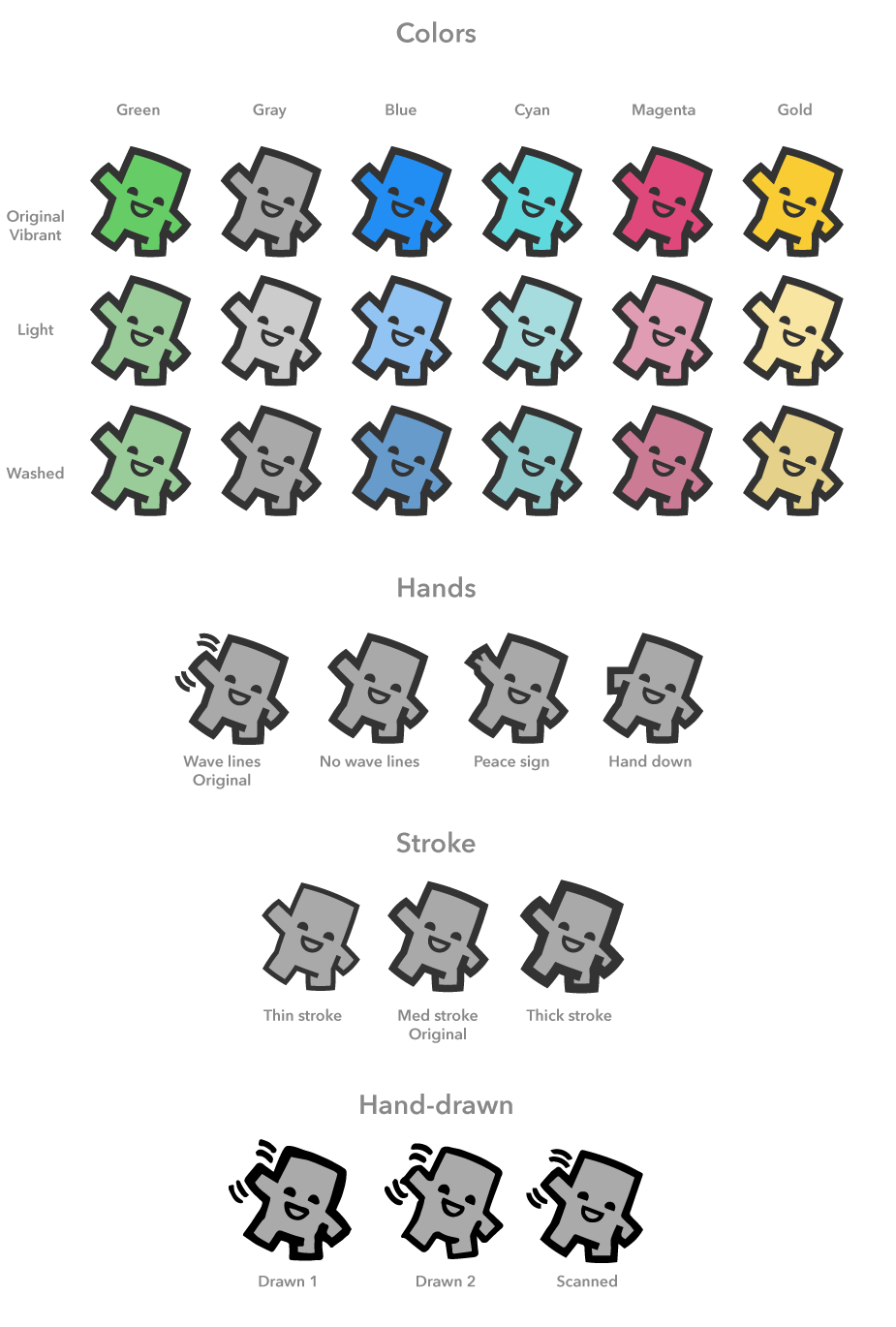
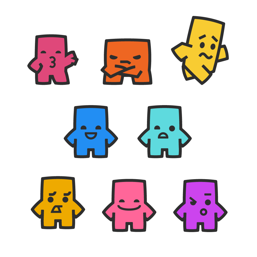
The 'green waver' was selected as the main logo. We also decided to build out his supporting cast. They represented the other friends in your crew: the selfie queen, the grumpster, and the person who you always have to convince to come out. I also provided multiple facial expressions, which could be used as default avatars or in messaging.
Alas, the Pre app is likely no longer available, but that lil' dude will keep on waving in my heart.
Interested in a logo for your work? Get in touch! Email yo@metafizzy.co to get started.
Every so often I encounter an issue with a Metafizzy plugin that I can't resolve its standard API. The only way to get it done is to overwrite core plugin code. These issues call for duck-punching. Paul Irish's post on duck-punching jQuery is a great overview.
Duck-punching is another name for monkey patching. Monkey patching is a technique to “extend or modify the runtime code of dynamic languages without altering the original source code.”
Let's say you want to add a class is-animating to Flickity when it is animating. Flickity does not have a startAnimation event. But it does have a startAnimation method on its prototype. We can duck-punch that method to add our desired behavior.
// get original methodvar startAnimation = Flickity.prototype.startAnimation;
// overwrite method
Flickity.prototype.startAnimation = function() {
// call original method
startAnimation.apply( this, arguments );
// do new stuffthis.element.classList.add('is-animating');
};
Let's break down what's happening here:
Store the original method as a variable.
Overwrite the method.
Within the new method, trigger the original behavior by calling the stored method with apply(). Pass in this and arguments to set instance and any arguments.
Add new behavior within the method.
Likewise, we can duck-punch the _create method to add an event listener on settle to remove the class.
// get original methodvar _create = Flickity.prototype._create;
// overwrite method
Flickity.prototype._create = function() {
// call original method
_create.apply( this, arguments );
// do new stuffthis.on( 'settle', function() {
this.element.classList.remove('is-animating');
});
};
By duck-punching prototype methods, we change the behavior of all Flickity instances. If you want to change behavior on individual instances, you can do so by duck-punching instance methods.
// create new instancevar flkty = new Flickity('.carousel');
// get original methodvar startAnimation = flkty.startAnimation;
// overwrite method
flkty.startAnimation = function() {
// call original method
startAnimation.apply( this, arguments );
// do new stuffconsole.log('start animation');
};
Duck-punching is a nice way to mess around with Metafizzy plugins without overhauling internal code. It's great for debugging, allowing you to shim in console.log like in the example above.
Duck-punching is one of those quirky features of JavaScript. At first it looks like a gross hack, but its usefulness makes it a thing of ugly beauty.